
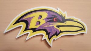
I had been bothering a few people at work with pictures and stories of the things I had built for the Wicked Woods and various theater projects. So I guess I shouldn’t have been too surprised when Steve asked me to make something for his Baltimore Ravens-themed basement. The original idea was to recreate one of their older logos, but then Steve had the idea of superimposing the Ravens’ bird profile logo over the ex-Baltimore (now Indianapolis) Colts logo.
I started with some images from the internet of each logo. Then, I used Microsoft Publisher to mock up how the two would look together. This made it easy to play with relative sizes of each logo as well as their relative orientation to each other. Once Steve was happy with the design, it was time to start making some sawdust.
After drawing a grid over both the printed images and the raw piece of wood, I transferred the images to the wood one grid square at a time. This method works really well and allows for scaling to pretty much any size, but it takes time. I recently read about another project that traced the image over carbon paper to transfer an image, which works great but you have to have the image and the carbon paper the right size. A projector would probably be simplest, particularly for larger projects, but it’s also more expensive.
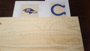
Once the outlines were in, it was cutting time!
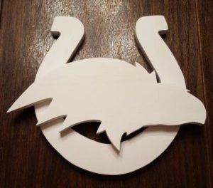
After sanding, it was time to paint. This where this particular project got very involved. There are several colors in the Ravens logo and I wanted to make it as accurate as possible. The grid method was an obvious solution, but before I could get to all the detail, I would be painting on a layer of white (for the overall outline) and a layer of yellow (again, for the outline as well as the interior of the “B”). Transferring a squared up grid onto a Ravens-shaped piece of wood was a challenge, but it got done.

From there, it was just a matter of painting in the details. I worked very hard to get the edges as crisp as possible. I even resorted to using a very fine paint brush which I swear had only one or two bristles. Not sure anyone would have noticed the difference it made to the edges, but I did. One thing that was frustrating was that both the black and the purple paint would not go down evenly on the first coat. So not only did I get to paint all this nice detail work, I got to do it twice!

Once everything was painted, both logos got coats of polyurethane. Then, I glued on the rounded heads of some white nylon fasteners that made great “nailheads” in the Colts logo. Finally, both pieces were fastened together with a spot of Gorilla Glue. It took longer than I expected to get it finished, but the results were worth it. And I got it done in time for football season!


This is awesome. Great idea and great execution.
Thanks! My friend still gets comments about it at his house.